Sunday, November 2, 2014

Digital artist- Russ Mills

Russ Mills- Flat Earth

Russ Mill's art almost feels like a sort of controlled chaos. He started with traditional art then found his way into digital art by creating album covers for music artists. The subject may be a little unclear, all we know is the figure is in some sort of deep thought. She seems almost serene. There are some words and numbers placed around her, however they are to light to read and possibly just an element to the chaos. Content may be the women's over thought. It also seems vintage, something soft about the piece. She has the black mascara looking paint running down her face making her seem sad about something. The form of this piece makes it hard for the viewer to look away. The swoop of the hair lead directly back to the women's face along with all the chaos. 
Overall I find this piece very thought provoking. I enjoy the ordered chaos mainly because it's not something I do myself. I prefer realism but highly enjoy chaos.

Citations:

"Images." RSS. Web. 2 Nov. 2014.

Wednesday, October 8, 2014

Colors!

So today I will be writing to you about color palettes! They are probably one of my most favorite things in art that I do. I love creating a palette that people can relate to, something that really creates a feeling. If you have a palette that is used for a melancholy composition you surely won't be using a bright hot pink! but thats just it, you can completely change a composition just by changing the color palette. So let me tell you about these specific palettes I've used.

Palette #1: This is an older color scheme that I have used in the past but I continue to find myself using it often. These colors are more of an analogous color scheme. I would personally use this for a melancholy picture, or something that I would like to look cool or underground. Because you know, it gets cold before it gets warm to get to the middle of the earth.

Palette #2: For this in particular palette I based it on what I consider galaxy colors. If you know me I love the galaxy. These are once again analogous colors which means they lay on the same side of the color wheels and reside next to each other. I would clearly use these colors for a galaxy piece. 


Palette #3: This palette is more of a compliment palette. Mainly because of the red and yellow. Thats the only reason this palette works, because its a compliment! which means the color is opposite from each other.
This palette would be tricky to use because of the red. I would use it where there is a light from a candle in a dark and damp room.


Photomontage

So the definition of Photomontage in the so called internet dictionary is " A combination of several photographs joined together for artistic effect or to show more of the subject than can be shown in a single photograph." 
My definition of Photomontage is " The process of cutting up photographs and joining two or more photographs together to create an illusion of an unreal subject. 
Both definitions are somewhat correct. Photomontage was first coined up in the Dadaism art movement.It started in 1916 in Europe. It was essentially to spit in the face of the current war that was going on. 
Dadaism is almost ironic. Like the art is art but its not or it was a movement but it wasn't or maybe even the artist were artist but not all at the same time. You following me here?
There were 3 great artists who came from the Dada movement. Hannah Hotch, she would take images from fashion magazines and illustrated journal. She would create humorous works of art that moved the society. She inspired many people during this era people like George Grosz, Theo Van Doesburg and Kurt Schwitters. However she wasn't the only one who came from the Dadaism movement there were two other people who came from it one being Grete Stern. She started with regular photography that was placed on the cover of magazines. She ended up moving to Argentina with her husband where she went to working on photomontage. The last mentionable person is El Lissitzky. He was an architect and a photographer who was born in Russia his work was the inspiration of the Bauhaus. His design is also the inspiration for many graphic artist today.
The inspiration for my photomontage project would have to be David Hockney.
He takes the image and splits it up into multiple different images but rearranges them into the same image only at different planes.


Citations: 

"Photomontage." Dictionary.com. Dictionary.com, n.d. Web. 8 Oct. 2014. <http://dictionary.reference.com/browse/ph

"photomontage." About. N.p., n.d. Web. 8 Oct. 2014. <http://arthistory.about.com/od/glossary_p/a/p_photomontage.htm>.

"What Dada Was and Why It Matters."About. N.p., n.d. Web. 5 Oct. 2014. <http://arthistory.about.com/cs/arthistory10one/a/dada.htm>.

"Hannah Höch." Hannah Höch. N.p., n.d. Web. 8 Oct. 2014. <http://www.whitechapelgallery.org/exhibitions/hannah-hch>.

"Sharing StoriesInspiring Change." Grete Stern. N.p., n.d. Web. 8 Oct. 2014. <http://jwa.org/encyclopedia/article/stern-grete>.

"El Lissitzky : Design Is History." El Lissitzky : Design Is History. N.p., n.d. Web. 8 Oct. 2014. <http://www.designishistory.com/1920/el-lissitzky/>.

Images:

http://mimighauri.files.wordpress.com/2010/04/photo-montage-hockneystyle.jpg

http://photo-3.wataugasd.whs.schoolfusion.us/modules/groups/homepagefiles/909660-1083309-109224-6.jpg

http://mrmartinexampleblog.files.wordpress.com/2012/09/hockney-david-1982-patrick-procktor-pembroke-studios-london-7th-may-1982-photo-montage.jpg


Saturday, September 20, 2014

Digital artist who are truly inspirational.

I have really never painted digitally before and I'm more of a traditional artist than anything but I'll tell you, I admire digital artist very much. Here are 5 of my all time favorite digital artists.


Wang Ling: An artist from China who is also an IC engineer. He is primarily found on DeviantArt under the name wlop.
Portfolio/Gallery: http://wlop.deviantart.com/gallery/
Aditya Ikranegara: a digital artist found on DevaintArt who goes by the name Aditya777. He is from Indonesia.
Portfolio/Gallery: http://aditya777.deviantart.com/gallery/

Chaotic-Muffin: They go by their DeviantArt name and come from the United States.
Portfolio/Gallery: http://chaotic-muffin.deviantart.com/gallery/

Lena Richards (AKA Oione): She is found in the United States. She has done book covers and illustrations.
Portfolio/Gallery: http://oione.tumblr.com/
Melanie Delon: An artist/illustrator from France who works in photoshop.
Portfolio/Gallery: http://www.melaniedelon.com/


Citations:


Wednesday, September 3, 2014

Bad and Good of Typography

For this blog post I needed to find examples of bad typography and good typography.

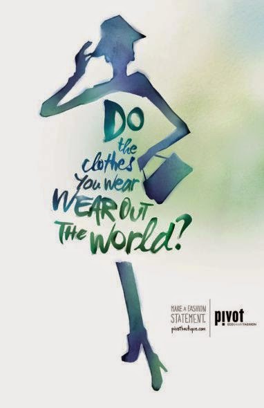
Here is a bad example of typography. Why you may ask, well I'll tell you.
At some points in the text you get  words that have Serifs others that are Sans Serif and you even get randomly placed cursive letters and words. There is an Orphan at the very beginning of the sentence and the various font sizes makes the reader squeeze the smaller words. Then you have stacking where the two words "wear" are on top of each other. You know when you're reading a book  and you come across a sentence that uses that that and even though you know its right its still bothersome to the eye. Yeah, that's what's happening here.
So, that wraps up the bad example of typography now to head on to the good example.


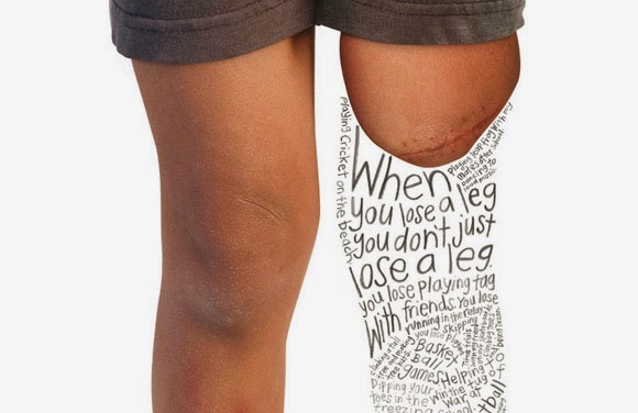
This is not only a good example of typography but also contains a message. However, I'm not gonna lie the leading down at the bottom of the image creates a small bit of bad typography but in retrospect there are no Orphans, there are no stacked words, and there is not a change in font half way through the sentence. Though there is a change in font size which leads into small writing and does get very hard to read. There are no rags, instead you get the shape of what used to be a leg creating a smooth shape.


This is what I find to be good and bad examples of typography. However I am new at blogging and thinking of the effects of text in ads and other things. Thanks for reading you guys! - J.J


Citation for the images:
Bad typography: "Veronica's blog." "Veronica's blog." N.p., n.d. Wed. 3. Sept. 2014.
<http://vportfolio.tumblr.com/>
Good typography: "Typography with a Message: 55 Powerful Examples." "Typography with a Message: 55 Powerful Examples. N.p., n.d. Web. 3 Sept. 2014. <http://www.onextrapixel.com/2011/01/04/typography-with-a-message-55-powerful-examples/.>