For this blog post I needed to find examples of bad typography and good typography.
 |
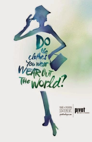
Here is a bad example of typography. Why you may ask, well I'll tell you.
At some points in the text you get words that have Serifs others that are Sans Serif and you even get randomly placed cursive letters and words. There is an Orphan at the very beginning of the sentence and the various font sizes makes the reader squeeze the smaller words. Then you have stacking where the two words "wear" are on top of each other. You know when you're reading a book and you come across a sentence that uses that that and even though you know its right its still bothersome to the eye. Yeah, that's what's happening here.
So, that wraps up the bad example of typography now to head on to the good example.
|
 |
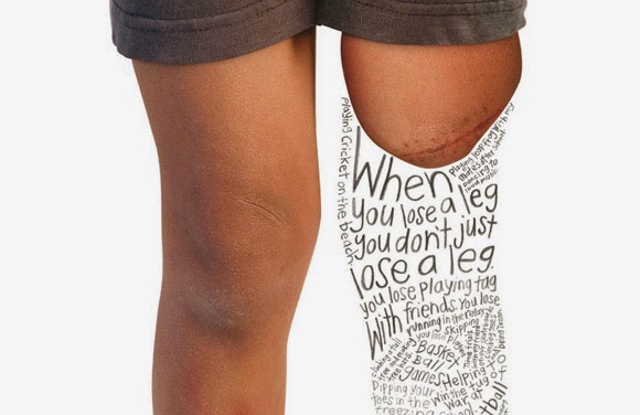
| This is not only a good example of typography but also contains a message. However, I'm not gonna lie the leading down at the bottom of the image creates a small bit of bad typography but in retrospect there are no Orphans, there are no stacked words, and there is not a change in font half way through the sentence. Though there is a change in font size which leads into small writing and does get very hard to read. There are no rags, instead you get the shape of what used to be a leg creating a smooth shape. |
This is what I find to be good and bad examples of typography. However I am new at blogging and thinking of the effects of text in ads and other things. Thanks for reading you guys! - J.J
Citation for the images:
Bad typography: "Veronica's blog." "
Veronica's blog." N.p., n.d. Wed. 3. Sept. 2014.
<http://vportfolio.tumblr.com/>
Good typography: "Typography with a Message: 55 Powerful Examples." "
Typography with a Message: 55 Powerful Examples. N.p., n.d. Web. 3 Sept. 2014. <http://www.onextrapixel.com/2011/01/04/typography-with-a-message-55-powerful-examples/.>


